Wednesday, October 28, 2009

Still Here (although I doubt there were search parties...)

I haven't posted anything since September 9th? Ah, like anybody's been sweating up a storm wondering where the Jimsbo went. I hit one of those little lulls in production that can happen when the day job takes center stage every day while you're laboring over what should take a team to do. Besides the results that come from a group of artist/creators collaborating, a team will also keep up your steam. When your creative juices run a little dry (it happens to most creative types now and then), you still have the feeling of responsibility to the team effort to keep you going. As a solo act, you get less done during those periods. I'll get back in the swing with it soon.

To follow up my last post below about Beatle day '09, I only just this past weekend received my Mono box from Amazon. Thanks to all the middle men merchants that snapped up the first batch to re-sell them at inflated "collector's" prices. It's a nicer set than the stereo for the packaging. The mini LP covers are far better than those stiff, dry, cardboard slots the stereo ones come in. They have inner sleeves! Why this isn't standard practice for cardboard CD covers I don't know. The stereo White album is a real bear to take out and replace the discs, putting the openings inside the folds. I guess if you have to have the stereo versions you're stuck with them. Fortunately, I prefer mono for music of that era. Stereo was new then and they didn't always mix things with headphones in mind. I'm no fan of vocals all crammed into one ear and rhythm tracks in the other, so mono works for me. The fact that they put more time into those mixes only makes it better. But enough about the Beatles and their ongoing efforts to lighten my pockets with the same stuff I grew up with.

For those few patient enough to follow this blog (hey, there's a couple that aren't just people I know and talk to all the time), I should be putting up something new soon enough. At least some type of holiday greeting.

Friday, September 11, 2009

Beatlemania '09


Since Beatle week is upon us, and I can't participate by getting a copy of the new set (sold out in the morning before I could even get there), I thought I'd post a couple of things I had handy (in digital form, that is) of the many I've done over the years of the the lads. I've done drawings, paintings, sculptures, construction paper cutouts and when I first got a sampler in the mid-80s, I even recorded an "original" music piece using only Beatle samples (I can't post audio yet, I still need to research where to put them first) but here's two. One goes back a ways, and the other is recent, but draws from another old one.

This first one is from 1981, one of a series I did that I brought copies of to Beatlefest that year to sell. Natural salesman that I am, I didn't move too many. There was this one of all four, and similar ones for each separately. There was also one of the picture from inside the Red/Blue albums, and one of John & Yoko with John's tale of "Jock & Yono" from the Christmas album transcribed. I need to find the originals of the others to scan them, the xeroxes don't do them justice (no wonder they didn't sell well).


And here's an advance peek at a background detail from "Money For Cheezums" and the latest work to feature the Fabbies. Some shots in the supermarket scenes will have actual products seen on shelves. To avoid any cease and desist issues, I'm opting to populate the shelves with fictional products and therefore use them to do a few throwaway gags and in-jokes. I had long ago thought of the concept of a box of molded chocolate Beatles sold as "Eat the Beatles", but since the scene where the boxes are onscreen is in the cookies/cracker aisle, I changed it to a box of cookies. To use the half shaded lighting of the Meet The Beatles cover, I made them half vanilla, half chocolate. The images are of clay models I also made in '81. I made molds to churn out copies, which I also had with me at the Beatlefest. I even sold a set to someone for $15. I used the molds to make fresh castings, took pictures, colored and texturized them to look like that kind of hard, dry, boxed cookies. A lot of work for a background element that'll only briefly flash on screen, but why not? Of course the "Meet The Beatles" cover is becoming less familiar now that they've been issuing the UK "With The Beatles" in the US all these years, but it's still known enough, I think.

So as you can see, These guys have been an influence all along for me, starting with growing up during it.

Wednesday, September 2, 2009

Airbrush Paintings


I put up some of my airbrush illustrations on my Flickr photostream. Only three so far. They're not so easy to just scan and post, though. They require two passes on the scanner and a reassembly in Photoshop. They also weren't stored all these years in the best conditions, so there's a lot of cleanup and repair to be done.

These were done in the early Eighties, as I was teaching myself airbrushing techniques. I haven't used the airbrush for many years now, it's not so easy to set up in a small apartment. Being able to do the same basic things in Photoshop without the messy hassle of the real thing is a help, the downside being there's no actual "original" art in the end, just an easily duplicatable file.

If you've ever tried using an airbrush, you'd know how sloppy the process can get. And as much as I love thinly spreading rubber cement onto a delicate film, then slapping it on my artwork and taking an x-acto knife to it, the masking and setup makes for 80% of the process. And oh how I loved chasing my loud, chugging air compressor across the floor when it's vibrations caused it to start drifting around. And the constant flushing out of paint cups to change colors was a hoot, with paint fumes and spray cleaner mist filling the air with a chemical intoxicant. Fun stuff.

As I get the time I'll scan in some more, like my incomplete collection of SCTV character caricatures. These first 3 are among the smaller ones, though. They all took 2 passes to scan in. I'm not sure how I'd do some of the bigger ones, there may be no way to even reach the center of them. Digital camera, I guess.


Saturday, August 29, 2009

The Character Scrapheap: Flotsam & Jetsam

Here's a character team I threw together years ago in a fit of "me too" type creative thinking. The idea was to take the classic two man comedy team; Laurel & Hardy, Abbott & Costello, Ren & Stimpy, and Harvey Kurtzman's Hey Look! strips, and kind of do it too. Because imitation is the sincerest form of riding coat tails.

Their look changed over the course of my entertaining the concept, but was always essentially the same, which was to combine Ren & Stimpy with Hey, Look! and add a dash of early Hanna Barbera. I worked up versions in Flash, and did a four page comic story to get an idea how to use them. I tried a couple others, but none went to completion. The very transparent cribbing seemed less a tribute and more a cop out. I'd rather not cast myself as "Cracked" to everyone else's "Mad", so their short development was scrapped. They may well make appearances in the thankless role of background extras in a crowd, but in the end the only slightly original element to them was using the phrase "Flotsam & Jetsam" as character names (at least, I don't think I've heard it used before), and that wasn't enough for me to continue with it.

Here's the 4 page comic, Triple Peanut

Tuesday, August 25, 2009

Coming Along

Progress has slipped a bit the past week or so, as I turned my attention to doing some study sketching and firing them off into the cyberspace void, but I'm getting back to the process of rebirthing this thing, and hoping it will come together by Fall. The problem always being that as I get better at this, I keep wanting to go back and do more to each scene.

The above is a test of background elements to get an idea of how it's looking. The specific backgrounds have yet to be done. Click it to enlarge.

Another big question is the music. The previous one, or "color animatic", had various HB cues and Raymond Scott snippets. I now have access to even more familiar cartoon music I might like to try, but there's still the rights issues. Of course, I'd ideally like to score it myself, and think I might be able to, but that would require learning how to compose that kind of music, and would add more time to the process. I may do another one with "placeholder music" until I have that together.

Saturday, August 22, 2009

Oh well...

Business as usual...


Tuesday, August 18, 2009

Sample Sketches


Here's a few recent studies, meant to show the drawing process, but I always find mine tend to have fewer sketch and construction lines evident. I tend to apply them very lightly, and many times just "see" them as I sketch. I always used to think it was because I wasn't really doing the work, but it came from wanting my sketches to look clean. I sort of trained myself to see the foundations and go right to the intended line. I still start with shapes and proportions, but go to details faster than normally recommended. I also have a long running habit of erasing as I go. Once I get line where I want it, I'll "erase and replace" the area to clean up as I go.


Here's a Daffy image. I partly chose it for the small challenge of finishing the drawing, since the top is cut off in the actual scene:


Here's a couple done just sitting on the couch sketching freeze frames. (just picked up the Sat Morning Cartoons 1960s vol. 1 set):
I only partially penciled in details on this pose to show the sketch lines underneath, but the weak blue pencil doesn't show up well in these scans. There's a certain stiffness to these, which comes from an initial copying. Once I learn a character's construction that loosens up.

I wanted to try some Spumco characters as well. I'd heard George Liquor was hard to do. I actually found his construction pretty easy to understand. Only one of these was from a sample (and the middle one didn't really work). They're far from perfect, but for first attempts I think I could get a feel for it:


Jimmy is trickier. Of course, it would have been easier to finish the walking pose if I hadn't placed it too low on the page to begin with. And the one on top definitely went off course:
I wanted to get more study sketching done last night, but my wonderful day job made quick work of that by giving my a cut straight up the tip of my index finger, making holding a pencil like trying to draw with a stinging bee. Thanks, great big drag of a necessary evil-type job! Wasn't enough to just stiffen up my back and limit the amount of time I can sit at a drawing table, I guess.

I started this Bugs last night, but fighting my throbbing fingertip was putting me off. I continued and added more detail to this, the the proportions are badly off (big damn head) so I'm just including the first scan to show some more of the work behind. The red pencil certainly shows better. Is that the purpose of using red, to show the work? I've always known about non-repro blue, but never heard why red was used.


find 'em bigger on flicker:

Sunday, August 16, 2009

The Whole Magilla

Magilla Gorilla
click to view

Here's the second show portrait. Although I was never as big a fan personally, I was only 3 when it premiered so he's been around as long as I can remember. I had set up a background that included an interior in the shop, but after watching the opening theme again I had to go back and redo it to reflect that version. It features a Peeble's pet shop that has no back wall, as if it were no more than a big window display on the street corner, further proving that Magilla had no business putting on a graduation cap if he couldn't even figure out he could just walk out at anytime.
And I had to include the show's biggest loophole; in most episodes, a central theme is Peebles being desperate to sell off Magilla, but every week in the theme he has a interested customer who can not only afford the 2 cents he's marked down to, but has the strength of an ant and happily carries him off. Did she regularly return him?

Thursday, August 6, 2009

Top Cat crew

Top Cat Gang
click to view
I wanted to start doing "cast portraits" of various cartoon shows. It's something I've done since I was a kid, but I never took them this far before, just sketchbook stuff. I actually started out by inking and coloring a sketch by John K of the Jetsons (which you'll also find in the photostream), but then wanted to do my own design. I picked the Top Cat characters to start with because I hadn't seen them done by anyone else, so I would be less influenced by what they did. Maybe the fact that the show ran the year I was born played a part too, but less consciously. It's actually been a while since I've watched any, and I think I may have misrepresented a couple of the character's personalities a little. What I'll do next I haven't decided yet. I'm not limiting it to just HB shows by any means, either.

The idea will be to bend the style and look of the show to my default cartoon style, and 60s HB blends well with it (since it was very influenced by it to begin with). I don't have any timetable for this though, it'll be taking a back seat to getting "Cheezums" finished, but I'll need to take occasional breaks anyway.

Wednesday, July 29, 2009

"Shake Your Betty"

Well, that's classy...

This trifle quickly became my most viewed clip on YouTube. I frequently got notices about new comments during it's run, the most popular one being "WTF?". I wasn't surprised.

It was just making the most out of unused scraps. My clip "Flintstones Forgery " has a moment where Wilma leaves the room by flipping her butt at Fred, and the first take on it seemed too much, so I changed it to a subdued version for that, but had this Wilma body left as a series of symbols in the project file. It was easy enough to flip the image, change the dress color to blue and swap in Betty's head, a few more frames and they were doing the bump.

I took that cycle, as well as ones of each alone, and just repeated them over different backgrounds for a minute or two. It didn't take long enough for me to stop myself and ask "what's the point of this?", so I then had this clip that amounted to nothing more than Betty & Wilma shaking their asses and doing the bump. I named it "Shake Your Betty", added the disco-era song you'd expect with a title like that and threw it up to see if I attracted a different audience than my other clips by being able to add "booty" to the tags.

It zipped past the others in views, easily 10 times whatever they were getting just being tagged "Cartoon", "Animation", and "Flash". More folks are searchin' for those booty clips out there! It held on for a while until early this year I received an email telling me there were music rights issues with using the song.

And that was enough of a sign that it was time to retire it. My claim to fame and bane of shame was deleted by user. It ain't going in any portfolio, either. I'm not looking to be known as the "Wilma's ass guy" any more than I am to be sued by a music publisher. I guess it would be hard to know if someone copied it and posted their own version of it somewhere, since that's what happened with Flintstones Forgery. I stumbled across someone's reedited version of it, and they never let me know they did it, so who knows? They're welcome to take credit for it. Let's just say every now and then Alan Smithee does a cartoon, too.

Tuesday, July 28, 2009

Escape From Obscurity?

Hello out there in cartoon-land! I've been frequenting the interconnected network of cartoon blogs branching out from "John K Stuff", and finding plenty of great artists out there with very similar influences. It's always seemed like there's a fine line between self-promotion and pest, and I've always been uncertain which side I'll fall on if I try to get the attention of people who seem to be doing the same things I am. Every one of them was a stranger to each other at one point, but by the time I know who they are I'll imagine it's practically an exclusive club that's not really looking for the intrusion of an"outsider". Not a useful thing to expect rejection, but if you're an artist, I'm guessing you're familiar with the term.


Well, I couldn't feel much more like an outsider in my day to day life, surrounded by people at work that share no interests other than earning paychecks. Half the time I'm surrounded by people all speaking a different language, which really makes you feel like you belong. Going through these blogs helps assure me that more people like me are out there, They just have no idea that I'm here.

I've tried the whole assuming I'll be looked at like a wanna-be pest for a while, so I thought I might give actually trying to become known a shot. I've been adding my 2 cents on John K's posts for a while, annoyingly peppering my comments with mentions of myself and what I'm doing. I've resisted doing the "Hey, check out my blog!" thing because I find it a little obnoxious to ignore the topic of a post and just comment with a cry for attention. I'll also start commenting on other people's posts to help gain a little familiarity within the "community", but then only when I actually have something to add.


Next I'll start popping up as a follower of the blogs that catch my attention, and I'll start to fill out a links list for my blog, so in the event that someone's on it they can jump to some of the other fun filled blogs from mine. The internet is certainly a blessing in allowing people to make their work easily available to be seen by whoever they'd like, but you still have to figure out how to intice them to go there first. I think it's often more likely someone will take a liking to your work if you're not actively trying to ram it down their throats. There's a tendency to resist something somebody has to campaign for your attention over, as if it must be worthless if they have to try so hard.

I'm not a natuarl born networker, so if you're an artist who's blog I liked and I send you something, fear not. I'm not likely to become a pest and keep sending things, I'm just fishing for gaining familiarity. So far I've probably creeped out Kali Fontecchio by sending her my take on her character. I hope she didn't think I was just looking to pass messages through her to John K, or that I had any other motives. I'm just attempting to become known by some folks. It may just result in not being taken seriously by those more professionally positioned, like it's cute that I'm playing "the home version of the game" and I was just looking for a pat on the head from a "Pro", or it may finally get me connected a little more meaningfully with some people for a change. They often say it's not what you know, it's who you know. Well, I don't know anybody, so what sort of chance does that give me? Anyway, it's really neither of those options, it's who knows you.


Putting your stuff online is a bit like a giant "Where's Waldo?" page, and even then, the difference is that people at least know what Waldo looks like. I think it gives me a slight advantage over waiting to see if other cartoonists and cartoon fans will show up at my apartment to see if anyone in there is drawing something they might like. 'Cause I've tried it. It turns out they don't so much do that.

Friday, July 10, 2009

The Opie & Anthony Animation Festival

Last April, I got a new Honda with XM radio, I was trying out some of the Opie & Anthony show, and heard they were having an Animation Festival in early June. The idea was to take audio from the show and animate visuals to go along with it. I'd seen some similar things posted online, some of them not that impressive from an animation standpoint, so I started to consider it. I found a 2 minute bit that gave me a few ideas, and started to work on it. by the time I got going, I only had a couple weeks to pull the whole thing together (nights & weekends only, of course), so I had to skimp on things like backgrounds, using mostly color gradients as a cheat. It wasn't brilliant, had several flaws, but it seemed fine for it's purpose. I sent it in, and got back an email saying it made the cut and would show at the festival.

I believe they chose about twenty, but I don't recall if they said out of how many total entries. The festival was held in NYC, which I'm close enough to drive to, but it's a haul. I also had to work that day, and since I long ago learned not to get all excited about contests, I opted not to try to get there.

I kind of wish I had, because it would've probably been the only way I'd have heard any reaction to it. I figured they'd discuss the festival on their show the next day, and although they certainly did, they deftly avoided ever mentioning my entry. They spent a good long while fighting with another finalist over some complaint he had, and plenty of time of several of the others, but not a word about mine. Oh well, the winner of the whole thing was a crowd pleaser I'm sure, but was little more than a "motion comic". Mainly stills with a few animated touches. I would have chosen a different entry, but not mine, as the winner in the end. A year later, did anything big happen for any of the other contestants? I haven't looked into it, but I know I'm still here, same as ever. I didn't have much expectations for it, after all.

I never posted it anywhere myself, although I spent a little time revising it with the idea of posting a "special edition" with added in-jokes and updated looks for the the guys (they both changed their hairstyles for the show, making my designs out of date), I didn't finish it because I started to question the purpose of it. Someone else posted it the next day, so I'll link that version here. It's also available on iTunes as part of a compilation of festival entries. The funny thing being that several of the clips, including the big winner, couldn't be included because the creators used copyrighted music in them. Way to limit yourselves, guys!

Here's the clip:

Wednesday, July 1, 2009

Trick Sandwich


I might as well put up a few of these pages. These are a collection of random panels, mostly done in the mid-eighties (and colored in the early 2000s). I put together a B&W mini comic a few years back of these that I hauled out to a couple comic cons (not the San Diego one, though). I called the collection "Trick Sandwich". There's over a dozen of them, so I'll post one every now and then. Let's start with this one, can't we?:
ts001
click to view

Saturday, June 20, 2009

More Bits of Progress


Here's a good example of how the animation is being upgraded in spots. This shot was almost static before. Naybob's entire head and body is a fixed symbol. For emphasis I used a squash and stretch on it at one point, but it's such a obvious Flash trick that it had to go. Here's the original setup:

The forced perspective didn't really work, she doesn't even appear to be looking at him. It's all cheats. And it's all gone. He now goes through 3 different key head positions as he speaks, and for extra emphasis on the word "your", I employed a little homage to Robert McKimson with an extreme, up-in-her-face pose. Not quite in his style, but that was the inspiration. He starts out like this:

Then he springs into the air and gets up close for the key word:


Of course, there's a smear along the way:
It may be overkill, but now every frame here is a decent still, all looking sharper than the main key frames did in the original. If I can get the whole thing close to this level, I may just succeed at ironing out the telltale "Flashness" of it. It's a lot of work for a dopey little story about cheese crackers, and nobody needs to do it, but I'm on it anyway...

I need to stress this is a mockup composition, and the background is not the one that will be used. It's merely to test the characters against it before I start creating the new ones. This is from "Altruists" from the Lost Episodes R&S disc (flipped backwards). It's the type of backgrounds I want to do for these scenes, so I wanted to try out something close. The perspective isn't quite a match for what it's supposed to be anyway, but it lets me get an idea how they'll look with painted BGs. I'll be switching gears here and there to start painting those. Haven't painted in a while, so that should be fun.

JC


Thursday, June 18, 2009

You should do that for a living, but don't quit your day job.

At every job I've ever had, sooner or later, someone will see a sample of my artwork (usually not even a good one) and say "You should do that for a living! You'd be famous! I always appreciate their enthusiasm, but I've grown very tired of having to react to that statement. They always look confused if I start to tell them the various harsh realities of the art and cartoon worlds. I don't even bother getting into the fact that the kind of things I want to do in those fields aren't even going concerns in the marketplace, just all the various hurdles and roadblocks facing anyone motivated to create art, music or film/video. Another thing they don't consider is that in that one workplace, I may have a standout ability, but outside, even limited to the more local population, I'm just another one of thousands. And perhaps not even one of the best positioned to get noticed.


Everyone has their own mix of talents and traits. Many have an artistic gift along with a ability to market themselves. Many can promote themselves vigorously but really have nothing special to offer. Many have the creative abilities but have almost no ability to find or exploit entry points into the business of their choice. To my dismay, I'm in group 3 here.


It's not like I've done nothing. I've lost my share of contests. I've sent out packets to people I thought might see something in my work though may have just as well sent them to Jupiter. I've even sat at tables at comics conventions, signing autograph books for people who had no idea who I was and didn't even buy one of my mini comics. There's one major thing I never did do, though. I never went to any school for it.


I always felt, and still do, that art is not something that should require schooling in the formal sense. Sure, there's tons of beneficial information to be gained by doing so, but you shouldn't be punished for not going through the mill if you do alright teaching yourself technique. And yes, the right art schools can provide you with connections in the people you meet and mingle with while there. I may well have enjoyed the experience if I could have afforded it, but that just didn't work out. The problem is this particular roadblock seems to come up all the time. Every time a new visionary creator/artist shows up on the scene, there's those school credentials again proving that without it, the chances are even smaller. I'm usually left with the feeling that without that certificate that says someone other than me showed me how to be creative, I might as well take all my home-grown, self-taught art and pound it down a rathole for all the biz cares.

As I've gotten older I've lost some of the feeling that I have to make it in my chosen field. It's such a tiny niche, and the competition is staggering. I'm constantly finding examples of published, produced and marketed art that is poor at best. Hundreds of things I know I could have done better. How do they get the work while I'm unknown and working in a mail center? There's no perfect, fair formula for who gets real work in the field. I know a lot of them made it by working harder at getting noticed than I have, keeping at it even with a growing pile of rejection letters.

If I had known way back when that I'd get to this age without making any progress, I'd have given more of a try to get into the field regardless of what was being produced at the time. If I had tried back then I may have met up with a young John K and ended up as an original "Spumco Big Shot". Or maybe I could have had a major impact on a lesser studio like Filmation or Ruby-Spears and helped them make something decent. Oh well, too late for that, but it's not too late for something to happen. Just a longer learning, study and practice period before trying to do something with it.

Right now, I'm steadily working on turning my first effort at a more or less full cartoon from what you could call a "color animatic" into a fleshed out cartoon so I have something to show. In the meantime I'll have to keep the day job, though.

JC


Tuesday, June 16, 2009

A Whole Range Of Change


The irony of going back and improving the art and animation in a cartoon that's ultimately about the pitfalls of "New and Improved" products certainly isn't lost on me. The difference in this case is it should actually make the product better.

The changes being made include improving the designs, adding more animation frames, rerecording some voices, and doing new backgrounds. In retrospect, I should have waited until I had learned more of Flash before starting it. I began this within a week or so of trying Flash, and attempted to make it out of scanned
in bitmaps traced into vector art in Flash. If you ever tried this in Flash MX you'd know the results are a real shaky, chunky line:

All of this crap is getting "ironed out" or thrown out. I may let one or two inbetweens go by with a few kinks, but for the most part, it's all getting fixed.

A big reason I let so much sub-standard quality go is I didn't have a Wacom tablet at the time. I don't have a lot of difficulty as far as drawing on a different surface than the screen (what, me afford a Cintiq?), but I can't get it goin' on with a mouse. I tried, but it's like a big electronic etch-a-sketch to me. The tablet made all the
difference, but by then all the hunka-chunka lines had been drawn.

Another problem was thinking I need to watch the file size. I nixed a lot of animation I would have done if I weren't trying to skate by on as few keyframes as possible. I had to break the thing into 5 parts just to chug it through my little underpowered iMac at the time as it is. Now that I'm not targeting a webtoon venue for it and the final product is an HD video file I don't have to worry about those limits.

Am I planning to turn it into flailing full animation?
No, I'm still a one man band, after all. My goal is to employ as much of the Kricfalusi model as I can, because I agree with his methods and enjoy his results. My own instincts are so close I can't help looking like I'm cribbing. Particularly the "Pyschodrama" kind of acting and a design sense influenced by the same masters. I've also read so many of his posts that a lot of his lessons couldn't help but penetrate.

Here's a couple examples of how some of the designs are being redone. Some only need to be cleaned up, but many are being outright replaced. Not surprisingly most of those are the drawings done by mouse that weren't part of the original comic, and I didn't design on paper first. In this reaction shot, when Naybob becomes aware a crowd is watching him, he goes from fondly gazing at the display of boxes to spotting the crowd. The original art isn't very lively, the oddly snub-nosed head never changes, only the eyes and mouth change. Screw it. It's gone. There's more inbetween them now, but here are the equivalent frames to the old ones side by side:


In this shot, he goes through 3 key expressions. The original ones all stunk, and the 2 measly inbetweens were worse. I'm not sure what the bullseye pupils thing was about, but it didn't work. And I never liked the compromise of the solid color sloppy shelves behind him. Here are the 3 keys:
There's another look behind the "under construction" walls. I've got a ways to go at my current schedule, so there will probably be more updates here as I go.

I should probably stop yakking to my keyboard about it for now and get back to working on it though, so bye for now.

Thursday, June 11, 2009

The Subject Of John K Influences

I should address this topic early on, because I'm sure if I succeed in reaching a wider audience down the road, the comparisons will continue, and I'd like to be clear on my creative intentions. I'm not trying to rip him off or do "his style". Yes, I'm certainly a fan, but I'd hate to have him consider me just another imitator.

He's 6 years older than me, and since I grew up with older brothers as an influence, that shortens the gap because they influenced me more than my own age group. What this amounts to is I grew up at the same point in history, and the reference points are largely the same.
That would account for a smaller piece of the equation, though. The bigger one is who stood out the most to me. For me it was Bob Clampett, and early Hanna Barbera (particularly the first 2 seasons of the Flintstones), & the Fleischer Popeyes. That's what turned my lights on initially. Sound familiar?

I can remember at very young age, watching Beany and Cecil cartoons and being struck by an intensity no other cartoons seemed to have. And in my house, we always waited and hoped whatever Looney Toons showcase that was on would show "The Great Piggy Bank Robbery", "Book Revue", or "The Big Snooze". These were my earliest and strongest influences.

When the new "Mighty Mouse" debuted, the dying candle was relit. Same as when the new Beany and Cecil flew by, and then Ren & Stimpy threw open the doors. I watched it with the simultaneous feelings of "I can't believe they're doing good cartoons again" and "I wish I could go flying off to join the team". And then he got booted off his own creation, and again I felt like the business had no place for my way of thinking.

By that point I was 30, and picking up and following unlikely dreams becomes less impulsive a choice. Plus I still had never animated beyond a flip book. I had studied plenty. As soon as I had a VCR I was going though classics frame by frame and studying technique. Did I check out every frame of Daffy's "Oh Ag-O- NEE, Ag-O-NEEEE" meltdown? Sure did! (if you're not picturing the scene just from that line, you don't know it well enough).

So then comes Flash (and if he did indeed have input into the very program as I've heard then thanks for that too!) giving me the ability to wrangle a mechanical version of the process that actually can give you the ability to construct animation at home. And if you have put all the automation of it in it's proper place you can get full animation out of it.

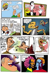
So now I can put my ideas in motion. The first thing I attempted was adapting a 5 page comic story that was meant to feel like a cartoon into one. It has "first attempt" written all over it, but it came out well enough that I threw it on up on the YouTube, and in no time it's compared to John K. It's not surprising, because we went to the same "school" at one time.

So, yes. There's a similarity, because there should be. We were taught the same principles. I draw my characters the way I drew them in 1991, 1986, or 1975 (only better with practice). Not all of them in the same style. I try not to have a "style". Perhaps an imprint, but not a steady constant approach. And I absorb influences into it. So if John's look is apparent in mine, it's layered on top of what I got from Barney Rubble, Uncle Captain and the Gremlins from the Kremlin.

I'm not sure what the dynamic would be like if I were working for him. I think I'd enjoy the team atmosphere, but I am used to full control as well (another reason I didn't strike out early to apprentice somewhere, Mr. wanna know it all wanted to start at the reins). I would like to get his attention long enough to see some of the clips. And it would be a major boon if he wasn't not impressed with it to a degree and offered a suggestion or something that could be incorporated enough to warrant a "consultant" credit on it in the end. That would be a jewel for it's homegrown crown.

To wrap up, I set my blog up here so that I could also participate in his. I'd be both honored and a little nervous to be on his radar, but I'd rather have him be aware of me if people are going to make the comparisons online.


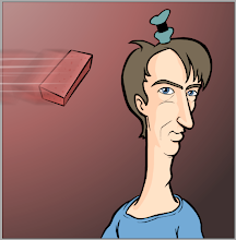
Does this look like the face of someone who would steal?...
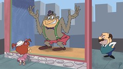


Flintstones Forgery

Here's my little experiment in using Flash to get a classic Hanna Barbera look. The idea started when it ocurred to me that I had all the basic ingredients to work with, from soundtrack CDs that provided clean music and sound effects cues, to the "First 14 Episodes" laser disc set that had one episode with a second audio track featuring only the dialog- perfect for extracting lines. I used screen grabs of the backgrounds, but recreated the characters and animations from scratch in Flash, using frames and cycles from various episodes as guidelines.

The basic approach was to string together what few lines I had that were generic enough to be used in a variety of ways (nothing specific to that episode's story, which unfortunately was heavy on guest characters and very little Betty or Barney to use). The lines eventually formed into what I ended up with. I also made the choice to just slightly subvert things with Wilma slightly off her rocker, Barney's XL nose, and a couple Fred expressions HB never really tried. The tone of Fred's "what're you doing here?" makes that moment seem strangely paranoid, but it was intended for a completely different type of scene, so I figured I'd make him look panicked about it.

I wish the Laser disc set had offered more epidsodes with that alternate soundtrack, I could have had a lot more lines to choose from and could have gone on a little longer. On the other hand, it's probably for the best that it kept the experiment short and sweet. I have my own characters and projects to do and too much more could just end up being a waste of time better spent.

There were two other Flintstones projects done at this time. "Dull Day In Bedrock" is still available on YouTube as well. It's much shorter and simpler by design, but it's amused a few people along the way. "Shake Your Betty" was by far the most viewed and commented of all my clips, but it's now removed due to the music used. It wasn't a tremendous loss, though, since it was also a less than mature lark and a way to exploit a simple cycle over and over. I'll cover that one in it's own post, though.

Here's "Flintstones Forgery"

Wednesday, June 10, 2009

The First Change

Here's one of the first things I changed for the New and Improved "Money For Cheezums" The girl who teases Naybob at the start of his journey has more clearly become a puppet (with no explanation as to where the strings actually lead to...) and has more fluid motion to her mouth. The original was mostly a single jaw moved around. She now has different mouth positions and shapes while still retaining the basic look of an old Bill Baird type puppet. She even has the right slow blink lids, going from 3 frames to 8. Her eyes were also changed.
Here's the original version, which recently received the comment "the neighbor's face bothered me a lot" on YouTube:


Here's the new version, with strings attached:


I also changed the proportions and made the head bigger, I hope the changes help make her more appealing, as I usually don't like to bother people a lot with my creations.