Saturday, August 29, 2009

The Character Scrapheap: Flotsam & Jetsam

Here's a character team I threw together years ago in a fit of "me too" type creative thinking. The idea was to take the classic two man comedy team; Laurel & Hardy, Abbott & Costello, Ren & Stimpy, and Harvey Kurtzman's Hey Look! strips, and kind of do it too. Because imitation is the sincerest form of riding coat tails.

Their look changed over the course of my entertaining the concept, but was always essentially the same, which was to combine Ren & Stimpy with Hey, Look! and add a dash of early Hanna Barbera. I worked up versions in Flash, and did a four page comic story to get an idea how to use them. I tried a couple others, but none went to completion. The very transparent cribbing seemed less a tribute and more a cop out. I'd rather not cast myself as "Cracked" to everyone else's "Mad", so their short development was scrapped. They may well make appearances in the thankless role of background extras in a crowd, but in the end the only slightly original element to them was using the phrase "Flotsam & Jetsam" as character names (at least, I don't think I've heard it used before), and that wasn't enough for me to continue with it.

Here's the 4 page comic, Triple Peanut

Tuesday, August 25, 2009

Coming Along

Progress has slipped a bit the past week or so, as I turned my attention to doing some study sketching and firing them off into the cyberspace void, but I'm getting back to the process of rebirthing this thing, and hoping it will come together by Fall. The problem always being that as I get better at this, I keep wanting to go back and do more to each scene.

The above is a test of background elements to get an idea of how it's looking. The specific backgrounds have yet to be done. Click it to enlarge.

Another big question is the music. The previous one, or "color animatic", had various HB cues and Raymond Scott snippets. I now have access to even more familiar cartoon music I might like to try, but there's still the rights issues. Of course, I'd ideally like to score it myself, and think I might be able to, but that would require learning how to compose that kind of music, and would add more time to the process. I may do another one with "placeholder music" until I have that together.

Saturday, August 22, 2009

Oh well...

Business as usual...


Tuesday, August 18, 2009

Sample Sketches


Here's a few recent studies, meant to show the drawing process, but I always find mine tend to have fewer sketch and construction lines evident. I tend to apply them very lightly, and many times just "see" them as I sketch. I always used to think it was because I wasn't really doing the work, but it came from wanting my sketches to look clean. I sort of trained myself to see the foundations and go right to the intended line. I still start with shapes and proportions, but go to details faster than normally recommended. I also have a long running habit of erasing as I go. Once I get line where I want it, I'll "erase and replace" the area to clean up as I go.


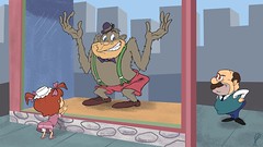
Here's a Daffy image. I partly chose it for the small challenge of finishing the drawing, since the top is cut off in the actual scene:


Here's a couple done just sitting on the couch sketching freeze frames. (just picked up the Sat Morning Cartoons 1960s vol. 1 set):
I only partially penciled in details on this pose to show the sketch lines underneath, but the weak blue pencil doesn't show up well in these scans. There's a certain stiffness to these, which comes from an initial copying. Once I learn a character's construction that loosens up.

I wanted to try some Spumco characters as well. I'd heard George Liquor was hard to do. I actually found his construction pretty easy to understand. Only one of these was from a sample (and the middle one didn't really work). They're far from perfect, but for first attempts I think I could get a feel for it:


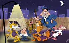
Jimmy is trickier. Of course, it would have been easier to finish the walking pose if I hadn't placed it too low on the page to begin with. And the one on top definitely went off course:
I wanted to get more study sketching done last night, but my wonderful day job made quick work of that by giving my a cut straight up the tip of my index finger, making holding a pencil like trying to draw with a stinging bee. Thanks, great big drag of a necessary evil-type job! Wasn't enough to just stiffen up my back and limit the amount of time I can sit at a drawing table, I guess.

I started this Bugs last night, but fighting my throbbing fingertip was putting me off. I continued and added more detail to this, the the proportions are badly off (big damn head) so I'm just including the first scan to show some more of the work behind. The red pencil certainly shows better. Is that the purpose of using red, to show the work? I've always known about non-repro blue, but never heard why red was used.


find 'em bigger on flicker:

Sunday, August 16, 2009

The Whole Magilla

Magilla Gorilla
click to view

Here's the second show portrait. Although I was never as big a fan personally, I was only 3 when it premiered so he's been around as long as I can remember. I had set up a background that included an interior in the shop, but after watching the opening theme again I had to go back and redo it to reflect that version. It features a Peeble's pet shop that has no back wall, as if it were no more than a big window display on the street corner, further proving that Magilla had no business putting on a graduation cap if he couldn't even figure out he could just walk out at anytime.
And I had to include the show's biggest loophole; in most episodes, a central theme is Peebles being desperate to sell off Magilla, but every week in the theme he has a interested customer who can not only afford the 2 cents he's marked down to, but has the strength of an ant and happily carries him off. Did she regularly return him?

Thursday, August 6, 2009

Top Cat crew

Top Cat Gang
click to view
I wanted to start doing "cast portraits" of various cartoon shows. It's something I've done since I was a kid, but I never took them this far before, just sketchbook stuff. I actually started out by inking and coloring a sketch by John K of the Jetsons (which you'll also find in the photostream), but then wanted to do my own design. I picked the Top Cat characters to start with because I hadn't seen them done by anyone else, so I would be less influenced by what they did. Maybe the fact that the show ran the year I was born played a part too, but less consciously. It's actually been a while since I've watched any, and I think I may have misrepresented a couple of the character's personalities a little. What I'll do next I haven't decided yet. I'm not limiting it to just HB shows by any means, either.

The idea will be to bend the style and look of the show to my default cartoon style, and 60s HB blends well with it (since it was very influenced by it to begin with). I don't have any timetable for this though, it'll be taking a back seat to getting "Cheezums" finished, but I'll need to take occasional breaks anyway.