The irony of going back and improving the art and animation in a cartoon that's ultimately about the pitfalls of "New and Improved" products certainly isn't lost on me. The difference in this case is it should actually make the product better.
The changes being made include improving the designs, adding more animation frames, rerecording some voices, and doing new backgrounds. In retrospect, I should have waited until I had learned more of Flash before starting it. I began this within a week or so of trying Flash, and attempted to make it out of scanned
in bitmaps traced into vector art in Flash. If you ever tried this in Flash MX you'd know the results are a real shaky, chunky line:

All of this crap is getting "ironed out" or thrown out. I may let one or two inbetweens go by with a few kinks, but for the most part, it's all getting fixed.
A big reason I let so much sub-standard quality go is I didn't have a Wacom tablet at the time. I don't have a lot of difficulty as far as drawing on a different surface than the screen (what, me afford a Cintiq?), but I can't get it goin' on with a mouse. I tried, but it's like a big electronic etch-a-sketch to me. The tablet made all the
difference, but by then all the hunka-chunka lines had been drawn.
Another problem was thinking I need to watch the file size. I nixed a lot of animation I would have done if I weren't trying to skate by on as few keyframes as possible. I had to break the thing into 5 parts just to chug it through my little underpowered iMac at the time as it is. Now that I'm not targeting a webtoon venue for it and the final product is an HD video file I don't have to worry about those limits.
Am I planning to turn it into flailing full animation?
No, I'm still a one man band, after all. My goal is to employ as much of the Kricfalusi model as I can, because I agree with his methods and enjoy his results. My own instincts are so close I can't help looking like I'm cribbing. Particularly the "Pyschodrama" kind of acting and a design sense influenced by the same masters. I've also read so many of his posts that a lot of his lessons couldn't help but penetrate.
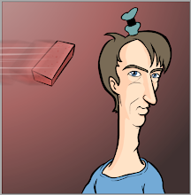
Here's a couple examples of how some of the designs are being redone. Some only need to be cleaned up, but many are being outright replaced. Not surprisingly most of those are the drawings done by mouse that weren't part of the original comic, and I didn't design on paper first. In this reaction shot, when Naybob becomes aware a crowd is watching him, he goes from fondly gazing at the display of boxes to spotting the crowd. The original art isn't very lively, the oddly snub-nosed head never changes, only the eyes and mouth change. Screw it. It's gone. There's more inbetween them now, but here are the equivalent frames to the old ones side by side:

In this shot, he goes through 3 key expressions. The original ones all stunk, and the 2 measly inbetweens were worse. I'm not sure what the bullseye pupils thing was about, but it didn't work. And I never liked the compromise of the solid color sloppy shelves behind him. Here are the 3 keys:

There's another look behind the "under construction" walls. I've got a ways to go at my current schedule, so there will probably be more updates here as I go.
I should probably stop yakking to my keyboard about it for now and get back to working on it though, so bye for now.


4 comments:
That's some amazing progress. The old expressions look like something out of a Powerpoint clipart collection. The new ones are grade A cartoons.
(pardon the mess)
Thanks! I shouldn't have tried drawing straight into Flash with an Apple mouse while just learning the hands on process, so there's been a lot of changes. I'm working on a scene now that's getting much more expressive than before. I haven't even posted the original here because I think of it now as more of a color animatic.
The new background won't be flat green, of course. It's out with the crude Flash art and in with new painted backgrounds (I have to get started on that...).
Post a Comment